Paper mode
Mastering Swiss Design
Unlock the timeless beauty of Swiss design and apply its principles to your creative projects.
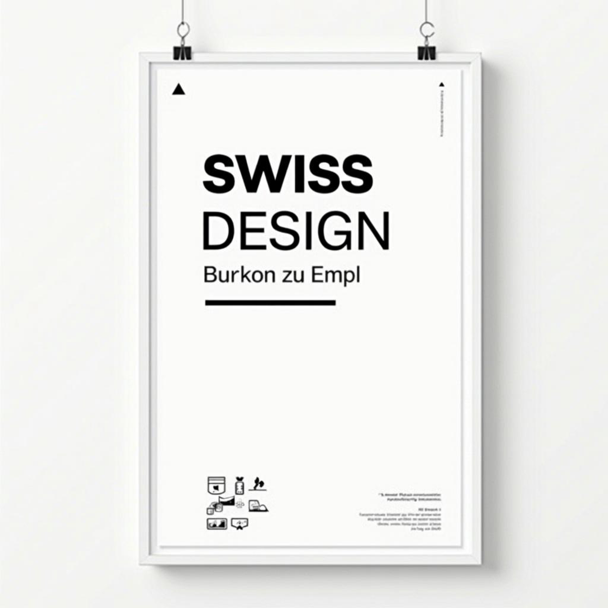
Swiss design has long been celebrated for its clean lines, grid-based layouts, and minimalistic approach. In this blog, we explore how these principles can still inspire today’s designers and how you can integrate them into modern design practices
Swiss Design, also known as the International Typographic Style, is one of the most influential movements in the history of graphic design. Originating in Switzerland in the 1940s and 1950s, this style brought a new level of clarity, precision, and functionality to design. Its focus on simplicity, clean typography, and a grid-based layout system has had a profound impact on modern design, influencing everything from print to digital interfaces. Whether you're designing a website, a poster, or a branding campaign, understanding the principles of Swiss Design can help you create more effective, visually compelling work. At the core of Swiss Design is the belief that design should be functional, not decorative. This means that every element in a design serves a purpose, and unnecessary ornamentation is avoided. The goal is to communicate information as clearly and efficiently as possible, with an emphasis on readability and legibility. This principle is particularly evident in the use of typography, which plays a central role in Swiss Design. Designers in this movement favored sans-serif typefaces, such as Helvetica, for their clean, modern look and legibility at all sizes. Typography is not just about choosing the right font—it's about how the text is arranged and how it interacts with other elements on the page. The grid system is another fundamental aspect of Swiss Design. A grid provides a structured framework that helps designers organize content in a logical and consistent manner. By aligning elements to a grid, designers can create a sense of order and harmony, ensuring that the layout is easy to navigate and aesthetically balanced. Grids also help maintain consistency across different mediums and formats, making it easier to adapt designs for print, web, or mobile. The precision and rigor of the grid system are what give Swiss Design its signature look—clean, organized, and timeless. In addition to its emphasis on grids and typography, Swiss Design is characterized by the use of minimalism and a limited color palette. Rather than using a wide range of colors, Swiss designers often stick to a few neutral tones, such as black, white, and gray, with occasional accents of bold primary colors. This restrained approach to color ensures that the focus remains on the content, rather than on the design itself. It also contributes to the overall sense of clarity and simplicity that defines the style. Swiss Design also places a strong emphasis on negative space, or white space. Negative space is the empty area around and between design elements, and it plays a crucial role in creating a balanced composition. By allowing elements to "breathe," negative space enhances the overall readability of the design and prevents it from feeling cluttered. This principle is especially important in today's digital world, where users are bombarded with information and need clear, uncluttered layouts to help them navigate content efficiently. Another key principle of Swiss Design is the idea of objectivity. Swiss designers believed that design should be neutral and objective, free from personal expression or subjective interpretation. The goal was to let the content speak for itself, without imposing the designer's personal style or emotions on the viewer. This approach is evident in the use of neutral, straightforward layouts and the absence of decorative elements or embellishments. While some may view this objectivity as cold or impersonal, it actually serves to enhance communication by allowing the message to take center stage. Swiss Design's influence extends far beyond its origins in mid-century Europe. Its principles have been embraced by designers worldwide and continue to shape contemporary design practices. In the digital age, where clarity and functionality are more important than ever, the grid-based layouts, clean typography, and minimalist aesthetics of Swiss Design are perfectly suited to web and app design. Websites, for example, often use grid systems to create responsive layouts that adapt to different screen sizes, ensuring a consistent user experience across devices. One of the most enduring aspects of Swiss Design is its timelessness. While design trends come and go, the principles of Swiss Design remain relevant because they are rooted in logic and functionality. A well-executed Swiss Design doesn't feel dated or trendy—it feels purposeful and efficient, regardless of when it was created. This timeless quality is what makes Swiss Design such a valuable approach for modern creators, whether they are designing for print, web, or mobile. Incorporating Swiss Design principles into your work can help you create designs that are not only visually striking but also highly functional. By focusing on clarity, simplicity, and structure, you can communicate your message more effectively and create a more enjoyable experience for your audience. Whether you're a seasoned designer or just starting out, mastering the principles of Swiss Design will give you a solid foundation for creating impactful, modern designs that stand the test of time. Why Swiss Design Still Matters Swiss Design's lasting influence on the design world can be attributed to its ability to blend form and function seamlessly. In an era where digital interfaces dominate and information overload is a common challenge, the clarity and precision of Swiss Design principles offer an antidote to the chaos. Its focus on user-centricity, grid-based layouts, and objective communication aligns perfectly with the needs of today's designers, particularly in fields like user experience (UX) and user interface (UI) design. In web design, Swiss Design's reliance on grids and minimalism translates into clean, responsive websites that perform well on all devices. As mobile-first design becomes the norm, the adaptable nature of Swiss Design is more relevant than ever. Designers who embrace Swiss Design are equipped with a toolkit that enables them to create user-friendly interfaces without sacrificing aesthetics. The style's emphasis on readability and negative space also helps improve the overall user experience by making content easy to digest. In conclusion, Swiss Design's influence is far-reaching and continues to shape the way we approach design today. Its timeless principles—clarity, functionality, simplicity, and objectivity—are as relevant now as they were in the mid-20th century. By mastering Swiss Design, modern creators can build a strong foundation for their work, ensuring that their designs not only look good but also communicate effectively and serve the needs of their audience. Whether you're designing for print, digital, or both, Swiss Design offers a blueprint for success that transcends trends and stands the test of time.
More Blogs
Books related to Swiss Design
Paper mode
Mastering Swiss Design
Unlock the timeless beauty of Swiss design and apply its principles to your creative projects.

Swiss design has long been celebrated for its clean lines, grid-based layouts, and minimalistic approach. In this blog, we explore how these principles can still inspire today’s designers and how you can integrate them into modern design practices
Swiss Design, also known as the International Typographic Style, is one of the most influential movements in the history of graphic design. Originating in Switzerland in the 1940s and 1950s, this style brought a new level of clarity, precision, and functionality to design. Its focus on simplicity, clean typography, and a grid-based layout system has had a profound impact on modern design, influencing everything from print to digital interfaces. Whether you're designing a website, a poster, or a branding campaign, understanding the principles of Swiss Design can help you create more effective, visually compelling work. At the core of Swiss Design is the belief that design should be functional, not decorative. This means that every element in a design serves a purpose, and unnecessary ornamentation is avoided. The goal is to communicate information as clearly and efficiently as possible, with an emphasis on readability and legibility. This principle is particularly evident in the use of typography, which plays a central role in Swiss Design. Designers in this movement favored sans-serif typefaces, such as Helvetica, for their clean, modern look and legibility at all sizes. Typography is not just about choosing the right font—it's about how the text is arranged and how it interacts with other elements on the page. The grid system is another fundamental aspect of Swiss Design. A grid provides a structured framework that helps designers organize content in a logical and consistent manner. By aligning elements to a grid, designers can create a sense of order and harmony, ensuring that the layout is easy to navigate and aesthetically balanced. Grids also help maintain consistency across different mediums and formats, making it easier to adapt designs for print, web, or mobile. The precision and rigor of the grid system are what give Swiss Design its signature look—clean, organized, and timeless. In addition to its emphasis on grids and typography, Swiss Design is characterized by the use of minimalism and a limited color palette. Rather than using a wide range of colors, Swiss designers often stick to a few neutral tones, such as black, white, and gray, with occasional accents of bold primary colors. This restrained approach to color ensures that the focus remains on the content, rather than on the design itself. It also contributes to the overall sense of clarity and simplicity that defines the style. Swiss Design also places a strong emphasis on negative space, or white space. Negative space is the empty area around and between design elements, and it plays a crucial role in creating a balanced composition. By allowing elements to "breathe," negative space enhances the overall readability of the design and prevents it from feeling cluttered. This principle is especially important in today's digital world, where users are bombarded with information and need clear, uncluttered layouts to help them navigate content efficiently. Another key principle of Swiss Design is the idea of objectivity. Swiss designers believed that design should be neutral and objective, free from personal expression or subjective interpretation. The goal was to let the content speak for itself, without imposing the designer's personal style or emotions on the viewer. This approach is evident in the use of neutral, straightforward layouts and the absence of decorative elements or embellishments. While some may view this objectivity as cold or impersonal, it actually serves to enhance communication by allowing the message to take center stage. Swiss Design's influence extends far beyond its origins in mid-century Europe. Its principles have been embraced by designers worldwide and continue to shape contemporary design practices. In the digital age, where clarity and functionality are more important than ever, the grid-based layouts, clean typography, and minimalist aesthetics of Swiss Design are perfectly suited to web and app design. Websites, for example, often use grid systems to create responsive layouts that adapt to different screen sizes, ensuring a consistent user experience across devices. One of the most enduring aspects of Swiss Design is its timelessness. While design trends come and go, the principles of Swiss Design remain relevant because they are rooted in logic and functionality. A well-executed Swiss Design doesn't feel dated or trendy—it feels purposeful and efficient, regardless of when it was created. This timeless quality is what makes Swiss Design such a valuable approach for modern creators, whether they are designing for print, web, or mobile. Incorporating Swiss Design principles into your work can help you create designs that are not only visually striking but also highly functional. By focusing on clarity, simplicity, and structure, you can communicate your message more effectively and create a more enjoyable experience for your audience. Whether you're a seasoned designer or just starting out, mastering the principles of Swiss Design will give you a solid foundation for creating impactful, modern designs that stand the test of time. Why Swiss Design Still Matters Swiss Design's lasting influence on the design world can be attributed to its ability to blend form and function seamlessly. In an era where digital interfaces dominate and information overload is a common challenge, the clarity and precision of Swiss Design principles offer an antidote to the chaos. Its focus on user-centricity, grid-based layouts, and objective communication aligns perfectly with the needs of today's designers, particularly in fields like user experience (UX) and user interface (UI) design. In web design, Swiss Design's reliance on grids and minimalism translates into clean, responsive websites that perform well on all devices. As mobile-first design becomes the norm, the adaptable nature of Swiss Design is more relevant than ever. Designers who embrace Swiss Design are equipped with a toolkit that enables them to create user-friendly interfaces without sacrificing aesthetics. The style's emphasis on readability and negative space also helps improve the overall user experience by making content easy to digest. In conclusion, Swiss Design's influence is far-reaching and continues to shape the way we approach design today. Its timeless principles—clarity, functionality, simplicity, and objectivity—are as relevant now as they were in the mid-20th century. By mastering Swiss Design, modern creators can build a strong foundation for their work, ensuring that their designs not only look good but also communicate effectively and serve the needs of their audience. Whether you're designing for print, digital, or both, Swiss Design offers a blueprint for success that transcends trends and stands the test of time.
More Blogs
Books related to Swiss Design
Paper mode
Mastering Swiss Design
Unlock the timeless beauty of Swiss design and apply its principles to your creative projects.

Swiss design has long been celebrated for its clean lines, grid-based layouts, and minimalistic approach. In this blog, we explore how these principles can still inspire today’s designers and how you can integrate them into modern design practices
Swiss Design, also known as the International Typographic Style, is one of the most influential movements in the history of graphic design. Originating in Switzerland in the 1940s and 1950s, this style brought a new level of clarity, precision, and functionality to design. Its focus on simplicity, clean typography, and a grid-based layout system has had a profound impact on modern design, influencing everything from print to digital interfaces. Whether you're designing a website, a poster, or a branding campaign, understanding the principles of Swiss Design can help you create more effective, visually compelling work. At the core of Swiss Design is the belief that design should be functional, not decorative. This means that every element in a design serves a purpose, and unnecessary ornamentation is avoided. The goal is to communicate information as clearly and efficiently as possible, with an emphasis on readability and legibility. This principle is particularly evident in the use of typography, which plays a central role in Swiss Design. Designers in this movement favored sans-serif typefaces, such as Helvetica, for their clean, modern look and legibility at all sizes. Typography is not just about choosing the right font—it's about how the text is arranged and how it interacts with other elements on the page. The grid system is another fundamental aspect of Swiss Design. A grid provides a structured framework that helps designers organize content in a logical and consistent manner. By aligning elements to a grid, designers can create a sense of order and harmony, ensuring that the layout is easy to navigate and aesthetically balanced. Grids also help maintain consistency across different mediums and formats, making it easier to adapt designs for print, web, or mobile. The precision and rigor of the grid system are what give Swiss Design its signature look—clean, organized, and timeless. In addition to its emphasis on grids and typography, Swiss Design is characterized by the use of minimalism and a limited color palette. Rather than using a wide range of colors, Swiss designers often stick to a few neutral tones, such as black, white, and gray, with occasional accents of bold primary colors. This restrained approach to color ensures that the focus remains on the content, rather than on the design itself. It also contributes to the overall sense of clarity and simplicity that defines the style. Swiss Design also places a strong emphasis on negative space, or white space. Negative space is the empty area around and between design elements, and it plays a crucial role in creating a balanced composition. By allowing elements to "breathe," negative space enhances the overall readability of the design and prevents it from feeling cluttered. This principle is especially important in today's digital world, where users are bombarded with information and need clear, uncluttered layouts to help them navigate content efficiently. Another key principle of Swiss Design is the idea of objectivity. Swiss designers believed that design should be neutral and objective, free from personal expression or subjective interpretation. The goal was to let the content speak for itself, without imposing the designer's personal style or emotions on the viewer. This approach is evident in the use of neutral, straightforward layouts and the absence of decorative elements or embellishments. While some may view this objectivity as cold or impersonal, it actually serves to enhance communication by allowing the message to take center stage. Swiss Design's influence extends far beyond its origins in mid-century Europe. Its principles have been embraced by designers worldwide and continue to shape contemporary design practices. In the digital age, where clarity and functionality are more important than ever, the grid-based layouts, clean typography, and minimalist aesthetics of Swiss Design are perfectly suited to web and app design. Websites, for example, often use grid systems to create responsive layouts that adapt to different screen sizes, ensuring a consistent user experience across devices. One of the most enduring aspects of Swiss Design is its timelessness. While design trends come and go, the principles of Swiss Design remain relevant because they are rooted in logic and functionality. A well-executed Swiss Design doesn't feel dated or trendy—it feels purposeful and efficient, regardless of when it was created. This timeless quality is what makes Swiss Design such a valuable approach for modern creators, whether they are designing for print, web, or mobile. Incorporating Swiss Design principles into your work can help you create designs that are not only visually striking but also highly functional. By focusing on clarity, simplicity, and structure, you can communicate your message more effectively and create a more enjoyable experience for your audience. Whether you're a seasoned designer or just starting out, mastering the principles of Swiss Design will give you a solid foundation for creating impactful, modern designs that stand the test of time. Why Swiss Design Still Matters Swiss Design's lasting influence on the design world can be attributed to its ability to blend form and function seamlessly. In an era where digital interfaces dominate and information overload is a common challenge, the clarity and precision of Swiss Design principles offer an antidote to the chaos. Its focus on user-centricity, grid-based layouts, and objective communication aligns perfectly with the needs of today's designers, particularly in fields like user experience (UX) and user interface (UI) design. In web design, Swiss Design's reliance on grids and minimalism translates into clean, responsive websites that perform well on all devices. As mobile-first design becomes the norm, the adaptable nature of Swiss Design is more relevant than ever. Designers who embrace Swiss Design are equipped with a toolkit that enables them to create user-friendly interfaces without sacrificing aesthetics. The style's emphasis on readability and negative space also helps improve the overall user experience by making content easy to digest. In conclusion, Swiss Design's influence is far-reaching and continues to shape the way we approach design today. Its timeless principles—clarity, functionality, simplicity, and objectivity—are as relevant now as they were in the mid-20th century. By mastering Swiss Design, modern creators can build a strong foundation for their work, ensuring that their designs not only look good but also communicate effectively and serve the needs of their audience. Whether you're designing for print, digital, or both, Swiss Design offers a blueprint for success that transcends trends and stands the test of time.
